Tabs
Tabs let you switch between different views by tapping or swipping the tab item with tab bar on the top of the screen.
Usage
Can be used to manage content when you have many different categories on the same page.
Tab with badge
Tab item can be configure to display a badge to provide additional information.
Available badge for Tab label:
- Status badge
{
    key: 'Hot',
    activeItem: `Hot`,
    component: <CustomScreen title="Hot" />,
    badge: {
      type: 'status'
    }
  },
- Counter badge
{
    key: 'Hot',
    activeItem: `Hot`,
    component: <CustomScreen title="Hot" />,
    badge: {
      type: 'counter',
      value: 99,
      max: 10         // Optional. Refer to Badge component for more details.
    }
  },
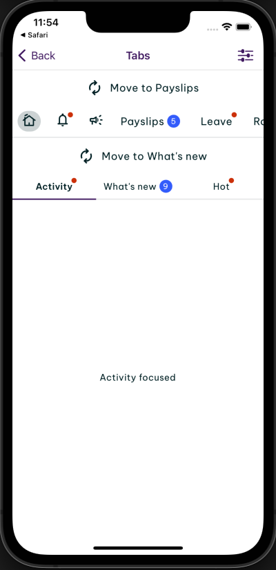
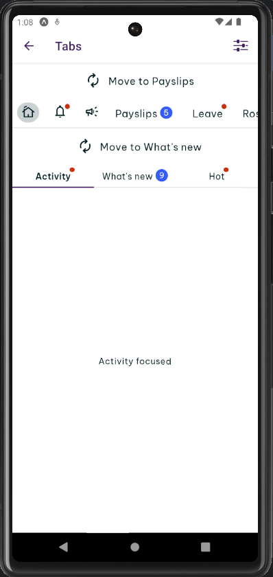
- hooks useIsFocused to render different content based on the current focus state of the screen.
import { Tabs } from '@hero-design/rn';

function ExampleScreen() {
  const isFocused = Tabs.useIsFocused();

  return <Text>{isFocused ? 'focused' : 'unfocused'}</Text>;
}
Preview
- iOS
- Android
Examples
There are 2 types: Tabs and Tabs.Scroll.
Tabs
Tabs comes with the same width for all items based on the width of the container.
Example 1
Tabs.Scroll
Tabs.Scroll is the horizontal scrollable Tabs that comes with dynamic width for all items. It supports 2 variants: highlighted and underlined. The highlighted should be used only on the primary navigation, while the underlined variant should be used for everything else.
Example 2
Props
Tabs Props
Prop | Required | Default | Type | |
|---|---|---|---|---|
onTabPress | required | (key: string) => void | ||
selectedTabKey | required | string | ||
tabs | required | TabType[] | ||
barStyle | StyleProp<ViewStyle> | |||
containerStyle | StyleProp<ViewStyle> | |||
lazy | false | boolean | ||
lazyPreloadDistance | 1 | number | ||
swipeEnabled | true | boolean | ||
testID | string |
Tabs.Scroll Props
Prop | Required | Default | Type | |
|---|---|---|---|---|
onTabPress | required | (key: string) => void | ||
selectedTabKey | required | string | ||
tabs | required | TabType[] | ||
barStyle | StyleProp<ViewStyle> | |||
containerStyle | StyleProp<ViewStyle> | |||
lazy | false | boolean | ||
lazyPreloadDistance | 1 | number | ||
swipeEnabled | true | boolean | ||
testID | string | |||
variant | highlighted | "underlined" | "highlighted" |